The way the anime industry approaches animation has changed a lot over the years. Limited animation has become extremely common as a cost-saving measure, interspersed with occasional explosions of smooth “sakuga” scenes that usually get clipped for promotion on social media.
Anime fans have also become more scrutinous of animation, with truly poorly produced shows like Hand Shakers being met with widespread ridicule. However, smart animators are more than capable of reducing the direct quality of their animation, without damaging the quality of the overall show, by allowing what might look ugly or low effort to serve a genuine purpose in the final product.
7/7 Golden Kamuy
Upon first look, Golden Kamuy seems like a rather serious show. The main goal of the story is locating a group of former prisoners with parts of a map tattooed on their torsos, with skinning them being by far the easiest way to complete the full map. Despite how morbid this premise is, though, the series is actually very comedic, and educational about Ainu culture.
These two aspects combine in the way the series treats bears. Bears are presented as important animals to the Ainu, but as wild animals, they also create chaotic situations for Sugimoto to get stuck in. While the manga already renders bears uniquely, the anime famously used some very janky 3D animation for the bears. While this could have easily come off as low quality, the bears end up being oddly hilarious and actually add to the series’ comedy.
6/7 One Punch Man
While One Punch Man features some amazing animated scenes and high-quality art, it was famously not nearly as well produced in its origin. Originally, it was a webcomic made by One, a mangaka whose artistic skills were famously rather underdeveloped when OPM was being originally serialized.
Paying homage to this simpler origin, the OPM anime will sometimes dip into an art style reminiscent of One’s original work, taking away the detailed shading or the largely realistic anatomy, and making the animation extremely simplified. Most often this is used with Saitama himself to show him reacting negatively to the hijinks of his co-stars.
5/7 Jojo’s Bizarre Adventure
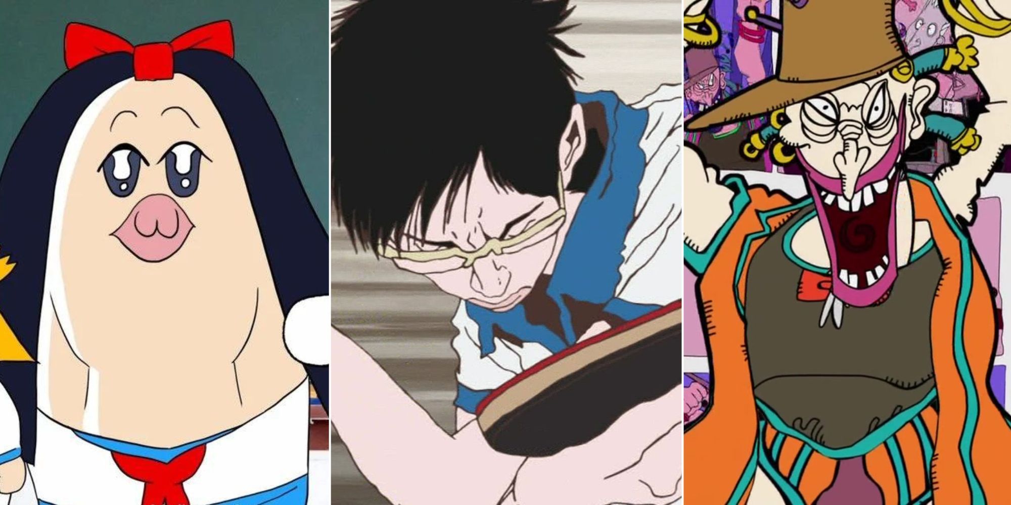
Jojo’s Bizarre Adventure usually has some of the best animation and detailed art of any anime. However, Jojo is also a show that loves submerging itself in the weird. In Jojo Part 3: Stardust Crusaders, one of the enemy stand users is a young boy called Boingo with a comic book for a stand.
Thoth is a rather weak stand, but the style in which it is drawn is a bizarre, almost pop-out book style that presents silly caricatures of all the main characters. This art style is also used for a special outro on all the episodes featuring Boingo, adding some unexpected variety and helping those episodes stand out.
4/7 Space Patrol Luluco
Studio Trigger is one of the most well-known and respected studios in the anime industry, partially due to its consistently stellar animation work. However, even the most talented creators don’t always have the money and time for another Cyberpunk: Edgerunners.
Space Patrol Luluco is one of a few shows Trigger has made on a small budget and manages to use this to its comedic advantage. The animation in Luluco is sparse, using its limited resources to create a fun sense of comedic timing. It even features a character who is essentially a looping fire gif attached to a still image, who still manages to be one of the funniest in the show.
3/7 Pop Team Epic
Even amongst the likes of Gintama, Pop Team Epic is a gag anime synonymous with chaos. From the satirical designs of its main characters to its erratic, sometimes hard-to-parse sketches, the show is always playing by its own rules, even if it usually puts it at odds with most other anime.
This goes especially for its “Bob Team Epic” segments, in which the usually clean and appealing art style is replaced by a grotesque, purposefully unappealing art style that wouldn’t look out of place among a toddler’s scribbles. The animation in these sections is also jittery and simple, helping to push the gross-out factor as far as can be for the sake of the joke.
2/7 Devilman Crybaby
Masaki Yuasa is easily one of the most prolific directors in the anime industry, even founding his own studio, Science Saru. His animation style is famously loose, with characters regularly warping off-model for the sake of a scene’s energy.
Likely the most famous use of this style is in Devilman Crybaby. When series protagonist Akira becomes fused with a demon, he gains superhuman athleticism. This enhanced physicality is portrayed in a bizarre fashion, with his running more akin to clawing at the air, with his limbs warping and bending unnaturally.
This is just part of how the demon characters are shown to be distinctly inhuman, in a manner that is as effective as it is strange to behold.
1/7 Ping Pong The Animation
Another Masaki Yuasa production, Ping Pong The Animation is easily one of the most unique-looking anime around. It goes all out with Yuasa’s loose animation style and has an extremely sketchy, abstract art style that is paired with a lot of anatomy and environment warping for the sake of reinforcing a scene’s energy.
The characters are rendered quite realistically, especially up close. Much attention is paid to their facial features, which twist and contort with effort as they play ping pong. At its most extreme, the character’s individual eyelashes, teeth, etc. will all be individually drawn, giving a very unpolished representation of a person under duress. It’s a far cry from the appeal-focused style most modern anime go with but is able to capture human physicality and passion in a uniquely compelling way.
