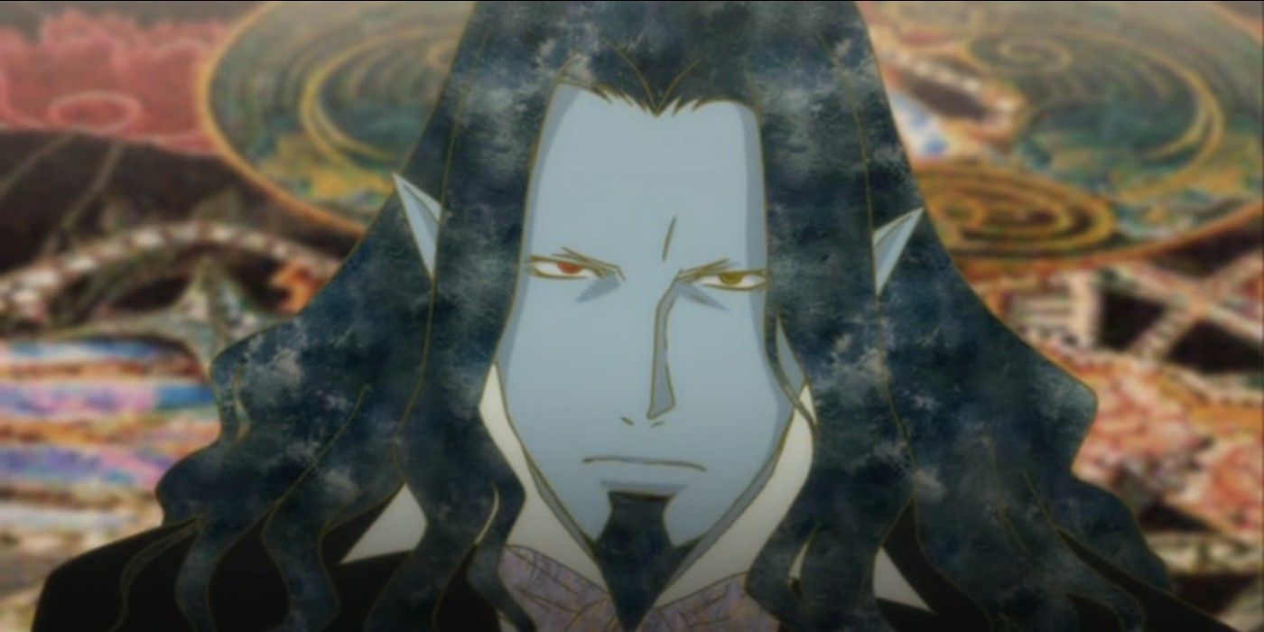
Gonzo has produced a number of memorable anime, with perhaps one of the most notable being 2004’s Gankutsuou: The Count of Monte Cristo. The series is immediately recognizable for its avant-garde visual style. Melding together classical Japanese Ukiyo-e with 19th-century Western art styles and the innovative fashion designs of Anna Sui, Gankutsuou cemented itself as an anime that can be recognized by any and every frame.
That said, few series have endeavored such an extensive and eclectic visual design in this specific way. Has Gankutsuou‘s visuals stood the test of time, or is it too extreme compared to the generally more streamlined visuals of anime today?
Gankutsuou Is Inspired By The Count of Monte Cristo
Gankutsuou takes inspiration from Alexander Dumas’s The Count of Monte Cristo. The anime primarily adapts the storyline and carries many of the same thematic elements, though it’s set in a highly decorative futuristic sci-fi world. Taking place in 5053, Gankutsuou follows former sailor Edmund Dantes after he escapes from prison to exact revenge on those who betrayed him. Aided by a mysterious demon known as Gankutsuou, Edmund dons a new identity as the Count of Monte Cristo to embed himself in high society and take his enemies down one by one.
The series features elaborately detailed patterns in its costume designs and backgrounds. Like many anime, the patterns in Gankutsuou don’t move or take the shape of the characters’ clothes, creating an interesting optical illusion as everything else is animated while the patterns remain stationary. However, given that the series makes such heavy use of patterns in almost every aspect, it may initially be a little jarring for new viewers.
The incredibly detailed European 3D architecture in combination with the equally — if not more — detailed patterns evokes a lush, high-class ambiance fitting for the story. The characters’ subtly colored outlines help build a contrast against the variety of textures in their costumes and the background. While the abundance of detail may be dense in comparison to current series, it’s executed with purpose.
Gankutsuou Delivers Design With Purpose
It’s safe to say not many series out there reach the same level of avant-garde in their visuals, with perhaps the closest exception being the 2007 anime Mononoke. While Gankutsuou came out in the early aughts, its unique visual direction shouldn’t so easily be thought of as outdated. It may be a huge contrast to the sleeker, more streamlined designs of most present-day anime, but the purposeful use of texture was simply another form of technical innovation to serve the story. More series don’t look like Gankutsuou likely because the artistic direction wouldn’t fit the narrative or further it. Gankutsuou‘s visuals are immersive and contribute to the surreal sci-fi environment and the 19th Century upper-crust society from which the series draws inspiration.
There are a variety of reasons an anime might stand out and forever be memorable, and visuals are often a big factor. Excellent, smooth animation in combination with unique designs help make a series engaging, and Gankutsuou takes that to the extreme. It’s a style that isn’t easily copied and may be an obvious stand-out in the mix of anime from today, but Gankutsuou‘s visuals stand the test of time. At first glance it may seem to be “too much”, but the execution of all its elements makes it such that its many-layered textures never appear garish or sloppy. This revolutionary style may not be commonplace, but it remains interesting, iconic and firmly grounded in the story’s origins.
All 24 episodes of Gankutsuou can be streamed on Crunchyroll.
